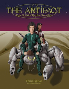
Enough moping around! Let’s make some progress with making third edition happen. Here are two versions of cover art that I’ve been working on.
This first one is the standard Georgia font that I’ve always used. Let’s call this the “classic” version.

This second one is thanks to Gladen Blackshield who introduced me to the Starstruck font. The art is the same, just a new take on lettering.

By way of a story to go with the art. . .
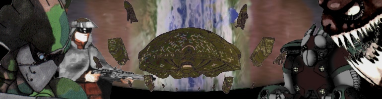
They’ve been in worse positions, an ASO research group investigates a relic believed to hold clues to the legend of the War Engines. Corporal Franklin spots movement in the darkness, her keen eye spots a Chezbah Hound a hundred meters out and drops to a prone position to get a better shot. She yells out to her team, warning of danger.
The hounds have circled them in the darkness and emerge in an ambush. Private Jorge Martian is the first to notice the ambush as a Hound leaps out at him he runs for a better firing position. More Hounds are on their way. Things are only getting worse, through his binoculars Scott just noticed something moving in on their position fast.
What do you think of each? Is there something they need? Anything that needs strengthening?
 The Free RPG Blog
Starstruck looks awesome – but it also really looks more like a fantasy font than Science Fiction.
Also, I’d pick a different subtitle. You use “Epic Science Fiction Role Play” on this site, which is absolutely better than just “RPG”.
Starstruck is a gothic font, so you might be right. I liked it because it suggests interconnecting paths to me.
Good point on the subtitle. I’m just trying to get the general feel at the moment.
Any impressions on the art? Hate it? Like it? Meh?
Kinda “meh”. The main guy in the front (with the rifle) kinda reminds me of the Akira comics (it’s been ten years since I read those so I could be wrong). That’s not a bad thing. The background characters and the color scheme are bland though. (They look like grayscale with a hint of color to me – could be my color vision problems, but I suspect they are very muted colors at any rate.)
I don’t like the toothy monsters, they look like sock puppets.
I’d move the characters down a bit and put the Artifact itself in the background, with its two suns and a nice starry background (need to make sure the image doesn’t get too busy though). The game’s called “The Artifact” – I figure it ought to be on the cover (kind of like the Death Star is all over Star Wars posters).
Did you have a bad run in with a sock puppet when you were a kid? 🙂
Putting a picture of the planet proper doesn’t seem right to me. Although I think a stylized representation might work as part of a logo.
Why not the planet itself? It’s hardly a secret.
Oh, as for font, i’d go with something simple:
http://www.dafont.com/ryoichi-tsunekawa.d2733?text=THE+ARTIFACT
or http://www.dafont.com/sansation.font?text=THE+ARTIFACT
or http://www.dafont.com/sf-movie-poster.font?text=The+Artifact
– of course my personal opinion only, I am *not* a designer so this might look horrible 🙂
The planet all by it self is representative but not very demonstrative. I’d like to display something of a story possibility on the cover and demonstrate what can be done in the setting.
It’s somewhat hard to do for me since the setting represents a lot and a good amount of it is interesting story wise, but I’ve never had a lot of success in drawing an example in a single frame that is wide angle enough to be representative of the larger picture.
Maybe that’s why collages are so popular in sci-fi but personally they bug me a bit. I’d like to catch a moment that demonstrates a wide range of possibilities, is slightly surprising so you look at it and say “that’s interesting” when you run across the image.
All that said, I’m no good at it and have been frustrating myself for a decade trying to come up with something.
I agree that just having a planet or other “thing” is not as compelling as characters – but at the same time I think a cover should also show-case the game, and your game’s focus is the artifact. I don’t thjink you need a collage of many different motifs, but just two – characters in foreground, artifact in background – probably doesn’t look too messy either.
Which also reminds me, I need to restart my search for an artist.
Well, we’ve been discussing things over here and the current picture is demonstrative but not representative enough of what we want the game to be. It’s literally back to the drawing board!